Posted by //
Sean
Date and Time //
Aug 15, 08 - 7:25 am
Categories //
Technology
Toys & Gadgets
Wireless
RSS Feed //
RSS 2.0
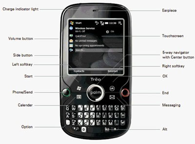
Palm accidentally uploaded a presentation about the Palm Treo 850 — aka Treo Pro — to a public Palm Web site, where it was spotted by bloggers and posted just about everywhere.
It is probably the best looking Treo ever but is that really saying all that much? It sure looks nice:

You can see additional pictures of it here and here.
Looks to have either a black or gun-metal finish to it, with nice sharp lines and clean buttons. My one issue is that it still looks chubby.
Palm Treos, even the latest 800w, are a lot thicker than the competition. Motorola, Samsung, Apple, and even RIM seem to know how to make thinner smartphones.
Other details that can be discerned from the presentation are that it will have a full 3.5mm headset jack for headphones, Wi-Fi and of course a touch screen, which all Palms have.
It also looks like it will run the Windows Mobile 6.1 platform and will have a micro-USB jack for transferring data.
When this device will launch is unknown, but it will be with a carrier such as T-Mobile or AT&T, because the first version of it will have GSM / UMTS radios.
This phone is a nice improvement for Palm in the looks department.
Since the next generation of Palm’s own operating system is not going to be available for a while, Palm needs to do its best with Windows Mobile phones if it is to remain relevant in the competitive smartphone market.
This entry was posted on Friday, August 15th, 2008 at 7:25 am and is filed under Technology, Toys & Gadgets, Wireless. You can follow any responses to this entry through the RSS 2.0 feed.
Both comments and pings are currently closed.
One Comment
Lucas wrote on August 15th, 2008 at 9:18 pm
I don’t know the field of PDAs very well, but how does the Treo compare to other companies’ offerings in terms of price? By keeping the Treo just a little thicker, they could be using some much cheaper components. Or maybe they’re simply courting the big-handed businessperson demographic.
I do know that I don’t think I would want to use that keyboard with the option button all the way to the left and the numbers almost as far. I’m sure I could get used to it, but I’m left-handed and I think using that keypad would be some rigorous exercise for my less-dexterous right hand. Unless that pic is real size, I mean – if it is really that small (or not much bigger) I can see why they would use that placement.